how it works
two ways to start
choose your layout, pick icons from each category and build your card from scratch or start from a ready-made structure and edit everything to fit your needs

shape & format
2 formats, 3 variations

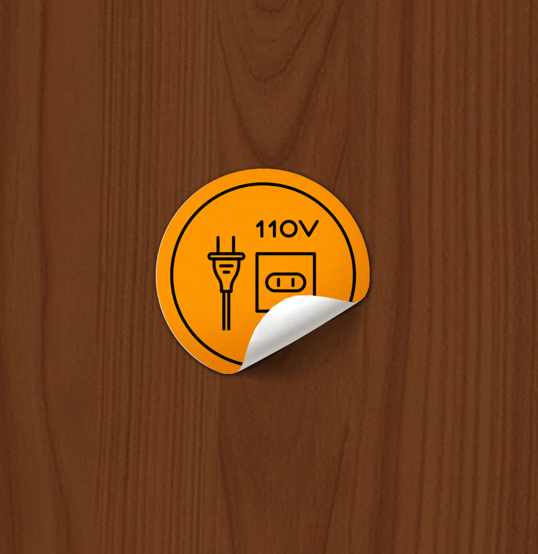
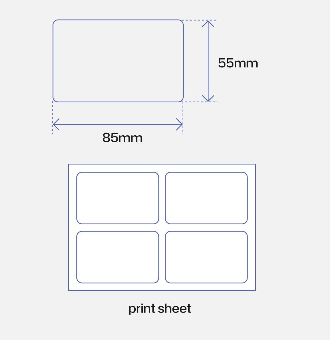
sticker only — printed on A5 sheet, 15-piece minimum
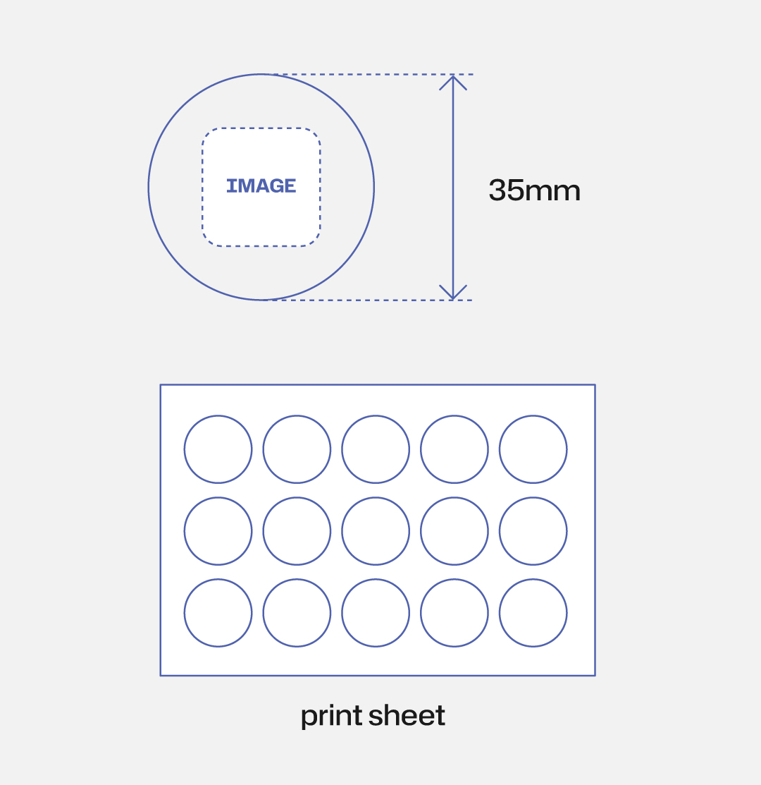


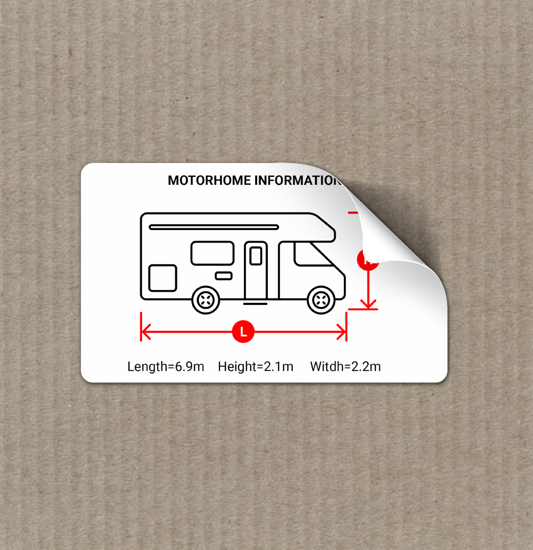
rectangular sticker, printed on A5 sheet, 15-piece minimum

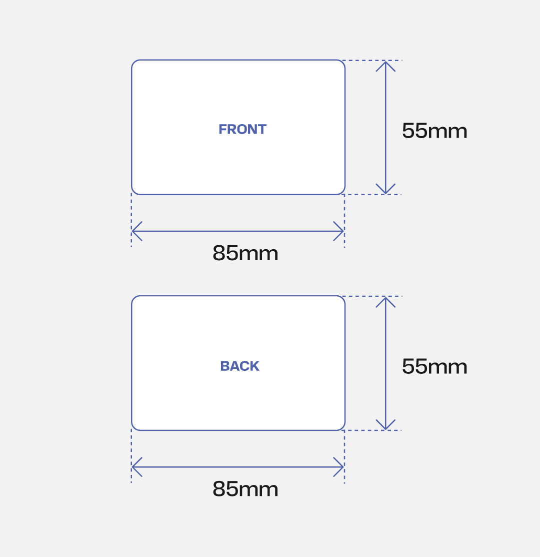
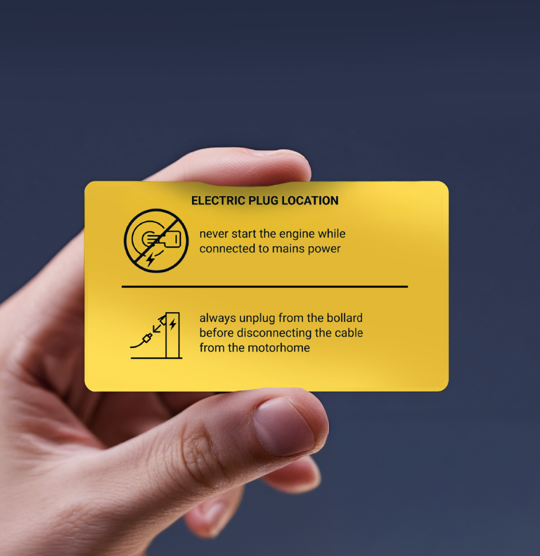
CR80 card, printable on both sides — available as a standalone piece, in a carabiner set, or mounted on a wood support

background & colors
5 background options, each optimised for a different context

clean, neutral background — displays icons in 2 colours

best suited for water-related imagery

maximum contrast — the most readable background in any lighting condition

recommended for warnings and high-priority instructions

ideal for glass surfaces — displays icons in 2 colours, available for stickers only
layout
3 core layouts, 5 total variations

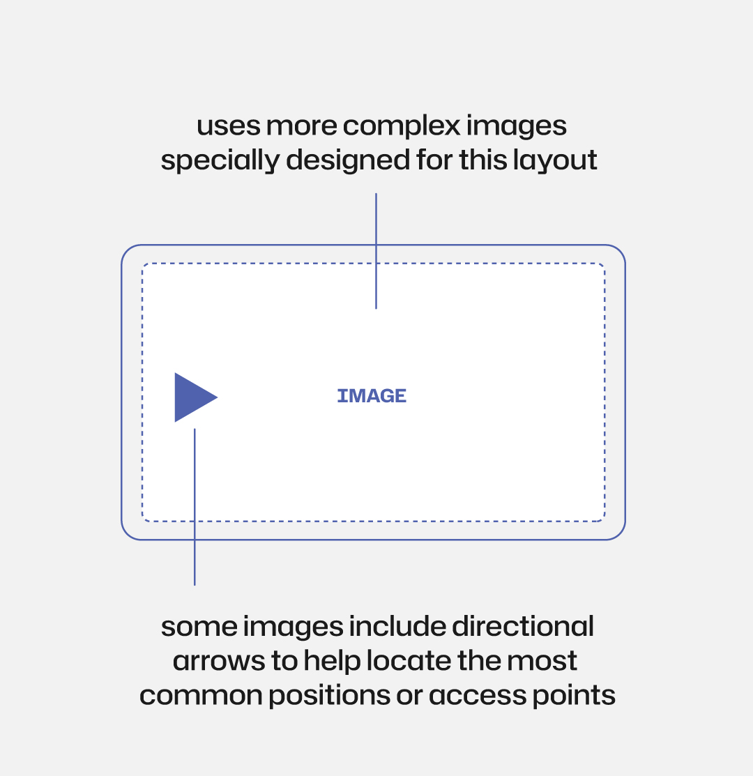
fills the card with a single image — best for showing location, context, or detailed visual references


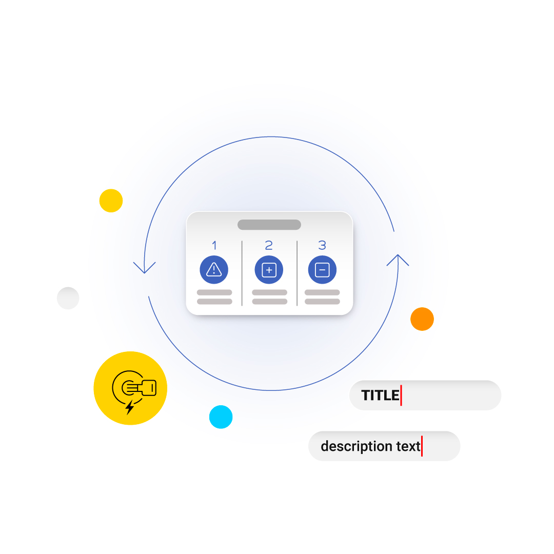
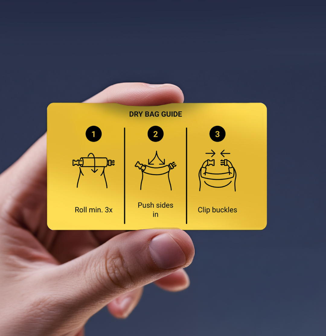
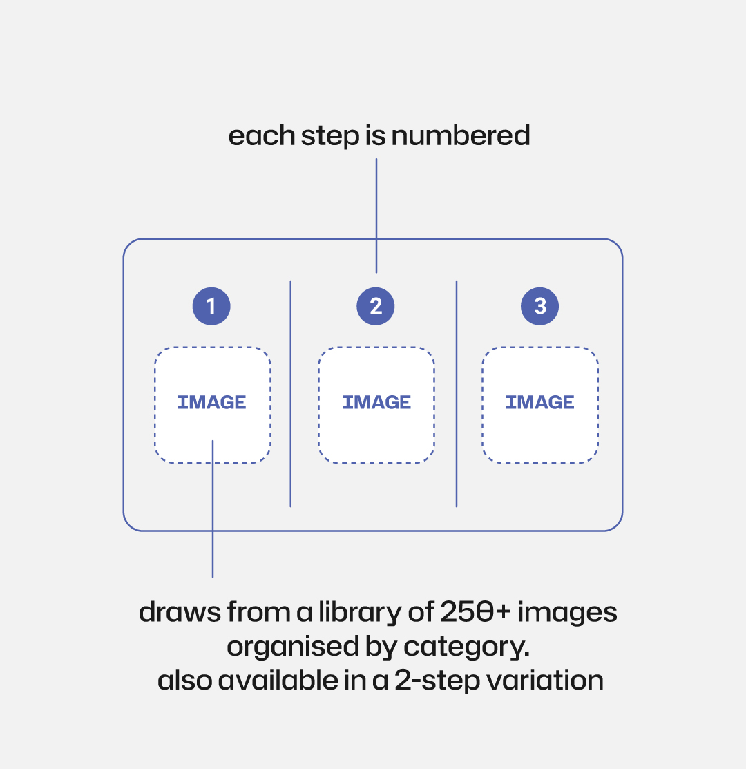
step-by-step format with numbered slots — supports up to 6 steps when used double-sided


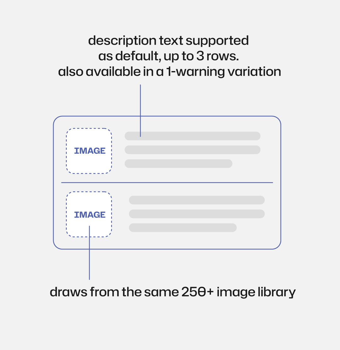
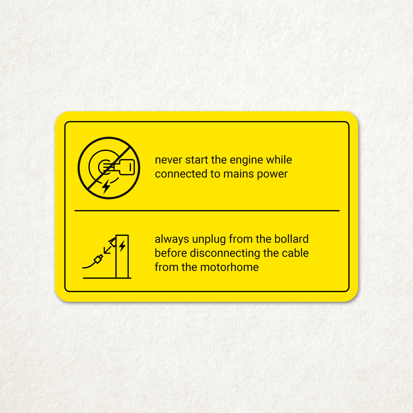
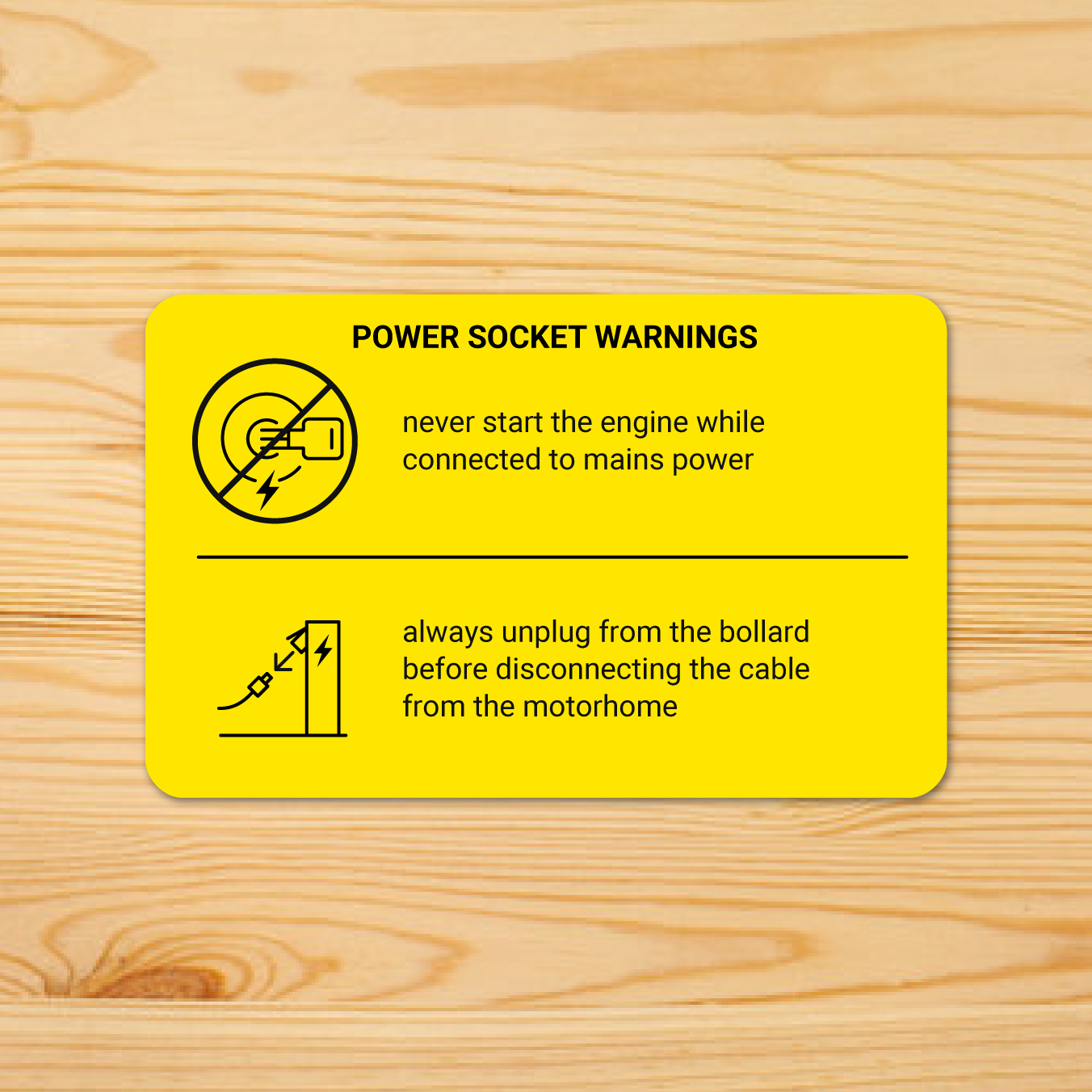
combines a prominent image with a text block — designed for warnings that need both visual and written clarity
images
build each slot in order — set, overlay, image
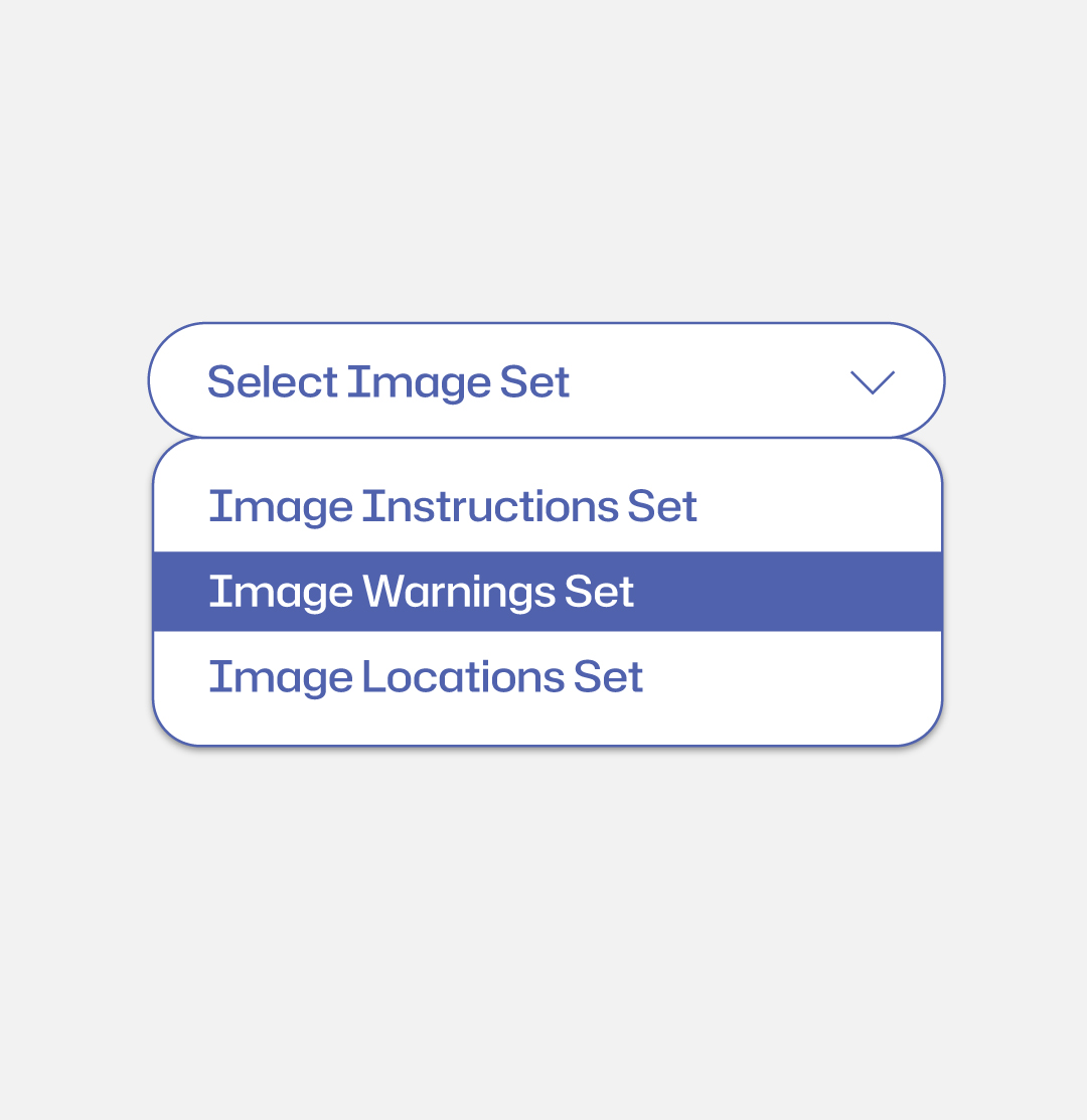
choose from 10 curated icon sets via the drop-down menu — each set is organised by category and use case


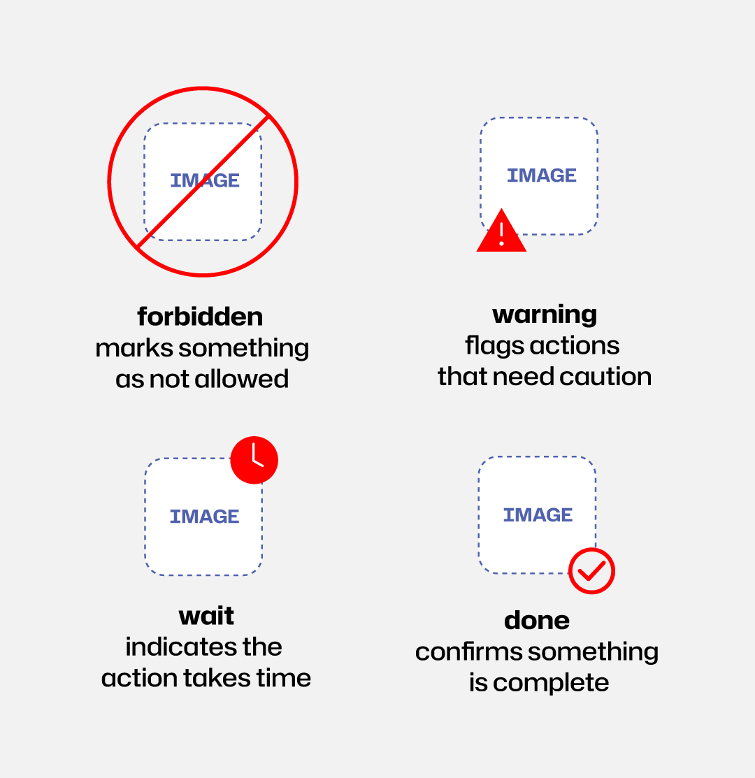
optionally add one of 4 overlays to any image — forbidden, warning, wait, or done
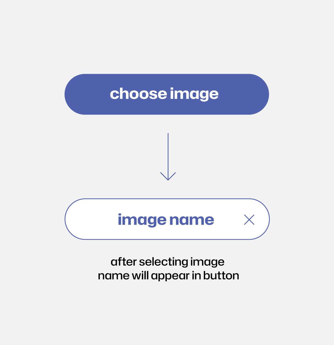
once an image is selected, its name appears on the button for easy reference
text
choose how each image slot is labeled
image only — a black border frames the icon to make it stand out
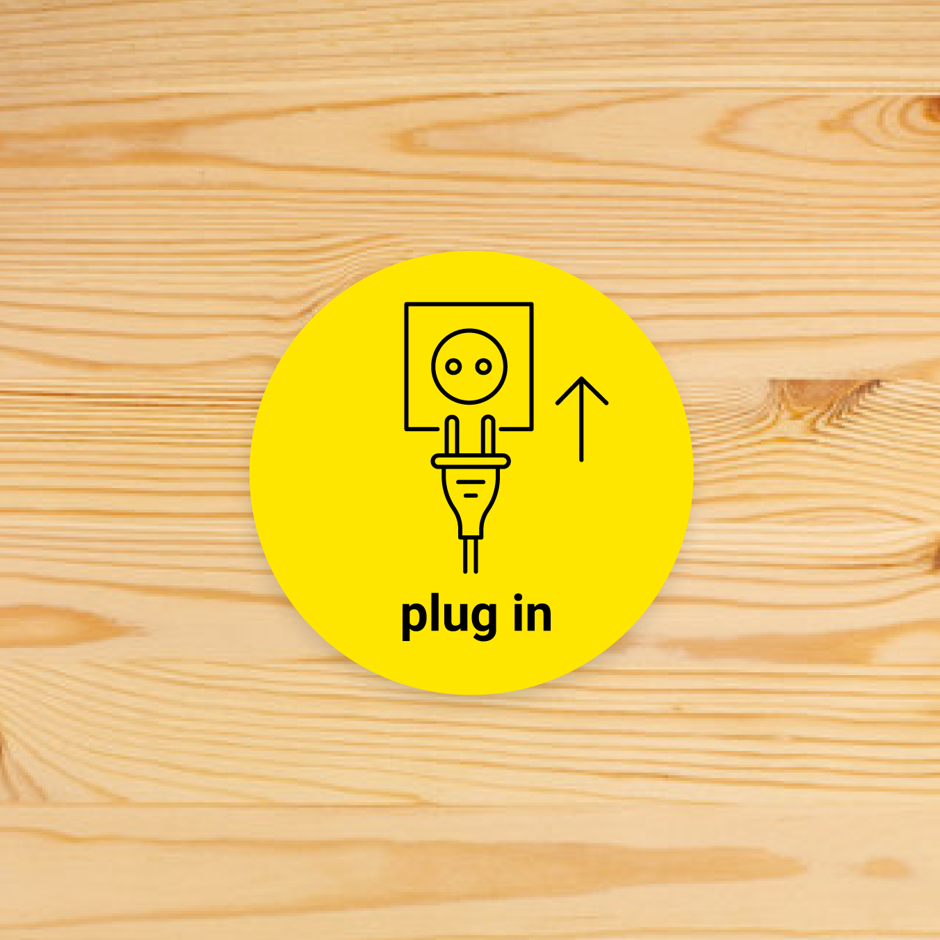
shows a custom text label under the image (max. 2 rows, 3 words)
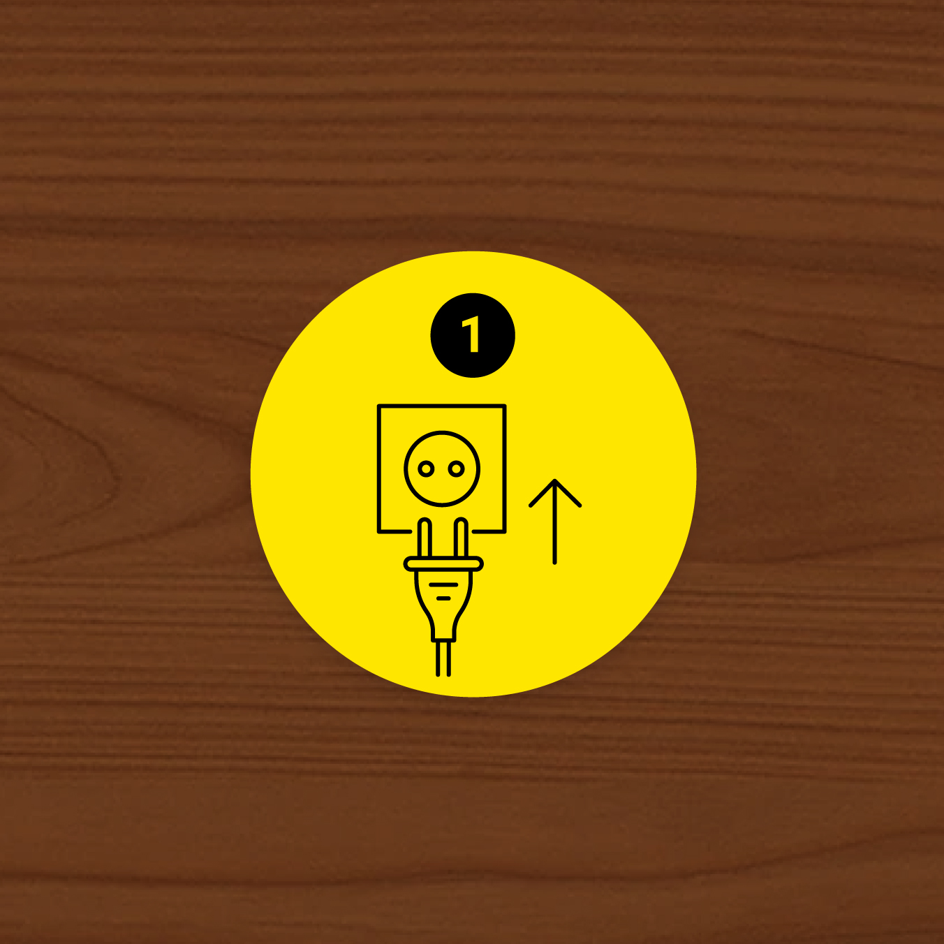
displays a sequential number, useful for step-by-step sequences (available for round design only)
preview
check the design and make edits

for double sided cards please make sure to check both front and back previews